Re: Yuba river moonrise
[Re: glamson]
#10504
Re: Yuba river moonrise
[Re: glamson]
#10504
09/19/07 05:39 PM
09/19/07 05:39 PM
|
Joined: Feb 2005
Manhattan, New York, New York
James Morrissey

I
|
I
Carpal Tunnel
Joined: Feb 2005
Manhattan, New York, New York
|
Hey George,
Not sure how I have missed this for the last few days. These are my thoughts.
James
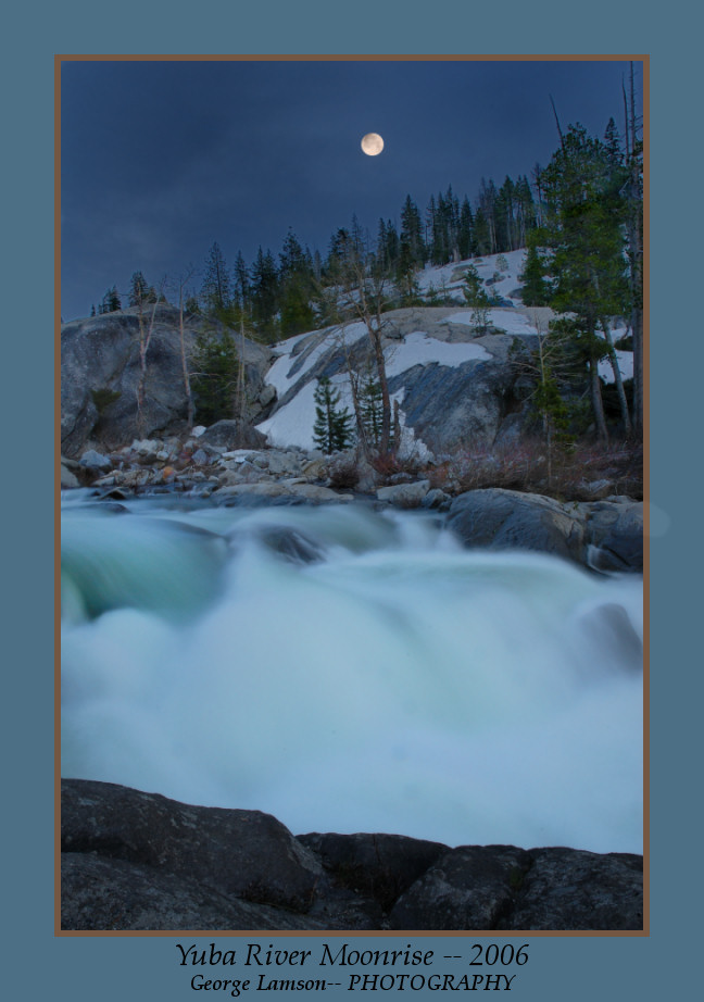
Composition/use of frame space - This is a great composition, and the more I see, the more I like. The currents are beautiful, and I like the addition of the moon - though I wish it weren't blown out (LOL, you can always drop one in later!). I go back and forth with the debris in the lower quarter of the frame - wondering if it should be cloned out or not. I think you did right by not touching it, but I am wondering how the shot would look from a few feet to the left.
Colors/White Balance - The colors are the thing about the photograph that I really like as well. The blue-green rushing waters are beautiful.
Exposure - You nailed the exposure beautifully. This is a trick shot. The moon, honestly, if it was slightly past sunset was not going to be exposed properly no matter what you did. There is just too much of a range between the foreground and it.
Creative use of Aperture/Shutter - This is definitely different. The freezing of the water in what I am assuming is twilight, is really beautifully done.
Emotion - LOL, I just feel cold when I see this image. That says something!
Post Processing - I already covered the few small areas about this image that I might consider tweeking.
Anyway, sorry you did not get any feedback on this shot earlier. I really like it a lot. Thanks for sharing.
James
|
|
|
Re: Yuba river moonrise
[Re: James Morrissey]
#10505
09/19/07 07:26 PM
09/19/07 07:26 PM
|
Joined: Feb 2006
Donner Summit, CA
glamson
OP
Veteran
|
OP
Veteran
Joined: Feb 2006
Donner Summit, CA
|
Quote:
Hey George,
Not sure how I have missed this for the last few days. These are my thoughts.
James
Composition/use of frame space - This is a great composition, and the more I see, the more I like. The currents are beautiful, and I like the addition of the moon - though I wish it weren't blown out (LOL, you can always drop one in later!). I go back and forth with the debris in the lower quarter of the frame - wondering if it should be cloned out or not. I think you did right by not touching it, but I am wondering how the shot would look from a few feet to the left.
Colors/White Balance - The colors are the thing about the photograph that I really like as well. The blue-green rushing waters are beautiful.
Exposure - You nailed the exposure beautifully. This is a trick shot. The moon, honestly, if it was slightly past sunset was not going to be exposed properly no matter what you did. There is just too much of a range between the foreground and it.
Creative use of Aperture/Shutter - This is definitely different. The freezing of the water in what I am assuming is twilight, is really beautifully done.
Emotion - LOL, I just feel cold when I see this image. That says something!
Post Processing - I already covered the few small areas about this image that I might consider tweeking.
Anyway, sorry you did not get any feedback on this shot earlier. I really like it a lot. Thanks for sharing.
James
James,
Thanks for the feedback. I was wondering if there was some reason no one was responding on this one. I figured either everyone was too busy or I'd really blown it on this one.
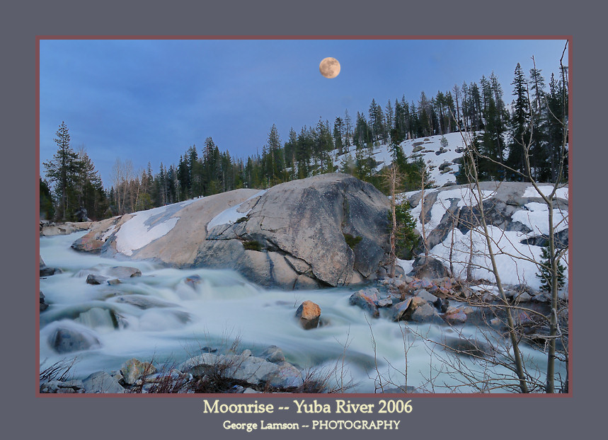
I have to LOL on the suggestion to "drop" in a moon. That is precisely what I did on the first version of this. I decided not to use that version because it looked to me exactly what it was and I figured I'd get comments to that effect. Here is the first version I almost put up. What do you think?
|
|
|
Re: Yuba river moonrise
[Re: glamson]
#10506
09/20/07 12:44 AM
09/20/07 12:44 AM
|
Joined: Oct 2005
Colorado, USA
Buddy Thomason
Traveler
|
Traveler
Joined: Oct 2005
Colorado, USA
|
George,
I've been looking at this image daily since you posted it and couldn't sort out my thoughts about it at first. Please forgive my begging off on a more formal structured critique and let me just say what I've been thinking.
It seems like two different images to me; top half (trees, sky and moon) and bottom half (rocks, water and branches). Having said that, I must add that each half doesn't seem to add much to the other. I like the bottom half best and in fact I like it a lot! I think it could stand on its own as a beautiful and evocative image.
With that in mind, I could also see this image with a much darker top half. As I view the image my initial focus point is the place of sharpest and greatest contrast: the relatively bare rock edge next to the darker trees above. From there my eye wants to read down into the beautiful shapes and forms below. Unfortunately, it seems like my eye also gets pulled away by what's going on above and the overall message of the image isn't getting through to me.
I previously wondered if the image would work more effectively in B&W but I think that was my way of wishing the two parts of the picture would come together better.
Re the moon: In the second image I bet you use a combo of a very faint global drop shadow around it and then some burning in of the edge all around - possibly a little blurring even. It would have to be very subtle but against the relatively light blue sky I think it would help. Even so, I think the moon would seem a little more at home in a darker overall top half of the image.
In spite of what I said above, there is an awful lot to like about the image. Thanks for sharing it as it has really provided me some food for thought.
|
|
|
Re: Yuba river moonrise
[Re: Buddy Thomason]
#10507
09/20/07 02:30 AM
09/20/07 02:30 AM
|
Joined: Feb 2006
Donner Summit, CA
glamson
OP
Veteran
|
OP
Veteran
Joined: Feb 2006
Donner Summit, CA
|
Quote:
George,
I've been looking at this image daily since you posted it and couldn't sort out my thoughts about it at first. Please forgive my begging off on a more formal structured critique and let me just say what I've been thinking.
It seems like two different images to me; top half (trees, sky and moon) and bottom half (rocks, water and branches). Having said that, I must add that each half doesn't seem to add much to the other. I like the bottom half best and in fact I like it a lot! I think it could stand on its own as a beautiful and evocative image.
With that in mind, I could also see this image with a much darker top half. As I view the image my initial focus point is the place of sharpest and greatest contrast: the relatively bare rock edge next to the darker trees above. From there my eye wants to read down into the beautiful shapes and forms below. Unfortunately, it seems like my eye also gets pulled away by what's going on above and the overall message of the image isn't getting through to me.
I previously wondered if the image would work more effectively in B&W but I think that was my way of wishing the two parts of the picture would come together better.
Re the moon: In the second image I bet you use a combo of a very faint global drop shadow around it and then some burning in of the edge all around - possibly a little blurring even. It would have to be very subtle but against the relatively light blue sky I think it would help. Even so, I think the moon would seem a little more at home in a darker overall top half of the image.
In spite of what I said above, there is an awful lot to like about the image. Thanks for sharing it as it has really provided me some food for thought.
Buddy,
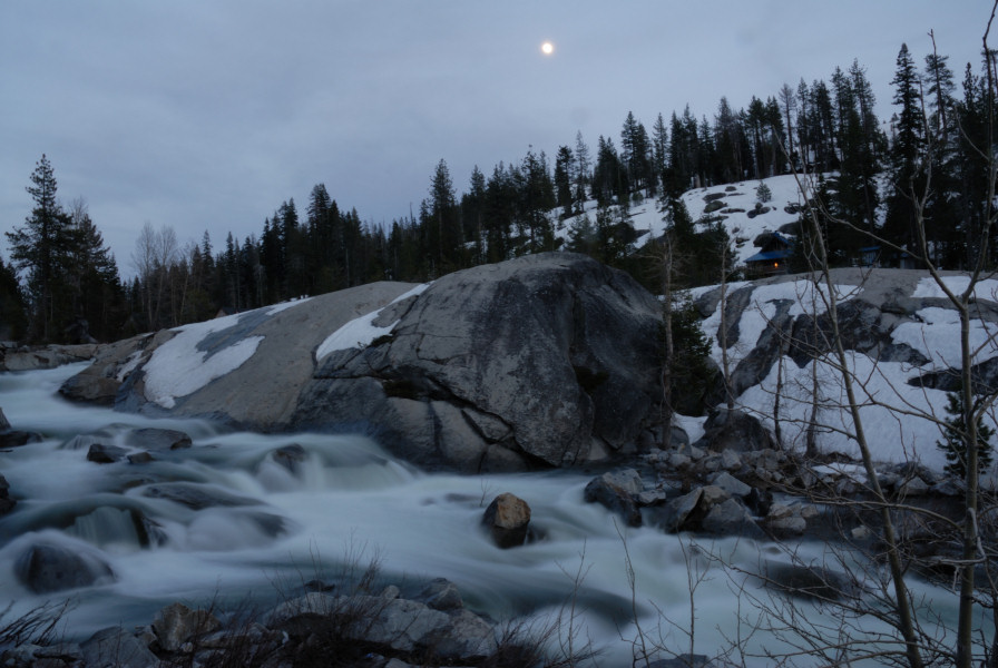
This is a little creepy because almost everything you said is also how I feel about this image. Actually I did darken the sky from the original but maybe not enough. But you are right about the separation between the top and bottom. I wanted this to work with the moonrise, but I may have been asking too much from this composition. This image was actually alot of work and I like it on alot of levels, but I don't think I would go for 30" print. Just for kicks I'm including the original out of the camera to show what I did in PP.
Thanks for the feedback. It is always appreciated.
|
|
|
Re: Yuba river moonrise - take 2
[Re: Darren Rowley]
#10512
09/26/07 06:14 PM
09/26/07 06:14 PM
|
Joined: Feb 2006
Donner Summit, CA
glamson
OP
Veteran
|
OP
Veteran
Joined: Feb 2006
Donner Summit, CA
|
Quote:
This second shot really works for me.
The first shot with the pasted moon needs to have some glow around the moon. Note in the original shot the sky is glowing around the moon (caused by the thin clouds in the sky). You need to try to get that same glow around the pasted moon and also the suggestions from Buddy.
Maybe the second shot could us some "moon glow" too.
I can't slip anything past you guys. I guess that's one of the reasons I post in the critique forum. Of course you hit on the real problem of trying to paste in a moon. There are in fact clouds that the moon is behind that blur it. In the pasted version of the first image I did blur the pasted in moon, but probably not enough. In the second one I blurred the moon to a greater extent and actually tried to get a "glow" effect by putting a little larger blurred moon on a new layer between the moon and the background. That did not work that well but did give a better effect that on the first image. I think the fact that the sky in much darker in the second image also works better with the pasted in moon.
I think I've gotten some great feedback on these images and thanks to all.
Geo
|
|
|
|
|
0 registered members (),
2,772
guests, and 3
spiders. |
|
Key:
Admin,
Global Mod,
Mod
|
|
|
Forums6
Topics641
Posts1,031
Members3,319
| |
Most Online4,088
Apr 28th, 2026
|
|
|