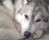
I guess it depends on what you are looking for. If you are asking - "which version would I be more likely to hang on my wall" - I would say color. However, if you are asking which version show more creativity, elicits more emotion - or makes the viewer wonder more about the intentions of the photographer, I am going to go with the B&W.
I think that the decolorized one has the bigger impact on me. Rustin, how did you do this effect? It does not look like a typical b&w filter. It is interesting to me because it almost has the look of something that has been photocopied.
The process was to convert the image to B&W as a new layer via Photoshop using a custom setting. The next step was to use the Select Color Range Shadows and then darken the shadows via levels, for the shadow range moved the midpoint (gray) to about .5-.6. Then used the Select Color Range Highlights then brighten again via levels but this time moved the shadow marker to the edge of the information and then moved the midpoint (gray) to about 1.75
Copyright
�2005 - 2020
Nature, Wildlife, and Pet Photography Forum. "NWPPhotoforum" and "nwpphotoforum.com"
are the property of Nature, Wildlife, and Pet Photography Forum. All Rights Reserved.
Wild Coyote Studio, New York Pet Photographer